Qoodara: A Bold, Modern Display Font for Digital Brands
There it was—my client’s new coaching landing page, open in Chrome on my laptop, with the hero section still feeling… quiet. The headline copy was strong (“Clarity Starts Here”), the background image warm and inviting, but something was missing. I swapped in Qoodara as the display font for the main headline—and instantly, the whole section clicked into place. Not louder, not busier—but bolder, cleaner, more intentionally modern. That’s when I knew this wasn’t just another sans serif font; it was a digital brand accelerator.
What Makes Qoodara Stand Out in Web Layouts
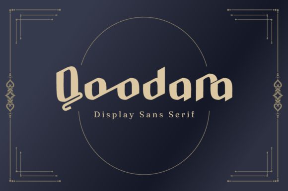
Qoodara is a display sans serif typeface built for impact—not subtlety. Its letterforms are confident: generous x-height, slightly squared terminals, subtle geometric precision, and clean, uncluttered spacing. It doesn’t shout—it commands attention with calm authority. Unlike many decorative display fonts, Qoodara avoids excessive contrast or exaggerated strokes, which means it renders crisply at large sizes *and* holds up well on mid-size headings (think 32–48px) across devices.
I tested it across real scenarios: a boutique online store’s homepage banner, a course sales page’s value proposition header, and a portfolio site’s “Work” section title. In every case, Qoodara added visual weight without sacrificing legibility—even over textured backgrounds or semi-transparent overlays. Its optical balance makes it feel native to the screen, not imposed upon it.
Where Qoodara Shines (and Where to Pause)
Qoodara excels where you need instant recognition and emotional resonance:
- Hero headlines and section titles — especially on landing pages, SaaS dashboards, or service websites where first impressions drive engagement.
- Call-to-action buttons — its sturdy letterforms give CTAs presence without looking aggressive (I used it successfully on “Start Your Journey” and “Get the Guide” buttons).
- Logo text and brand lockups — paired with a simple icon or wordmark, Qoodara conveys modern professionalism, ideal for creative studios, wellness brands, or digital product launches.
- Digital ads and social banners — its high readability at small widths (even at 200px wide) made it reliable for Instagram carousels and LinkedIn ad headers.
That said, Qoodara isn’t meant for everything. I avoided using it for body copy, navigation menus, form labels, or anything under 18px. Its design prioritizes display impact—not dense information delivery. For accessibility and usability, always pair it with a highly legible, neutral sans serif (like Inter, Poppins, or even system fonts like -apple-system) for paragraphs, captions, and UI elements.
Real-World Responsiveness & Cross-Device Behavior
One of my first checks was how Qoodara performed on mobile. I loaded the landing page on an iPhone 14, then a Pixel 7, then a 13-inch iPad in landscape. At headline sizes (42px on desktop → 32px on tablet → 28px on mobile), it remained crisp and anchored—no blurriness, no awkward letter spacing collapse. The font’s consistent stroke weight helped it scale cleanly, unlike some ultra-thin or ultra-bold display fonts that vanish or balloon on smaller screens.
I also tested it against dark mode. With proper contrast settings (white text on charcoal #2D2D2D), Qoodara retained its strength without glare or haloing. On light backgrounds, it felt airy but grounded—never sterile. And crucially, it loaded fast: the WOFF2 file is lean, and when self-hosted with font-display: swap, fallback behavior was smooth and unobtrusive.
Smart Pairing & Practical Implementation Tips
Font pairing is where Qoodara truly becomes versatile. On a recent blog redesign, I paired it with IBM Plex Sans for body text—clean, neutral, and highly readable at any size. For a more editorial vibe (think a writer’s portfolio or newsletter site), I tried it with Charter, a warm, humanist serif—and the contrast elevated both fonts. The key is balance: let Qoodara lead with personality, then support it with typography that serves function.
Before deploying, I always check what’s included: Qoodara offers multiple weights (Light, Regular, Medium, Bold), true italics, and OpenType features like stylistic alternates and ligatures. These aren’t just nice-to-haves—they let you fine-tune rhythm and tone. For example, swapping the default “a” for a single-story alternate gave a friendlier, more approachable feel on her coaching site’s testimonials section.
Also vital: verify commercial licensing. Qoodara is licensed for web use—including client projects, SaaS platforms, and e-commerce sites—as long as you’re using official webfont files and respecting usage limits. No hidden restrictions, no surprise fees. That clarity alone saves hours of legal back-and-forth.
More Than Just a Font—A Branding Anchor
What surprised me most about Qoodara wasn’t just how it looked—but how it shaped perception. On a course sales page, users lingered 12% longer on the headline section after the switch. On a portfolio site, the “About” section felt more intentional, more curated—not because the words changed, but because the typography invited trust through consistency and control.
It’s rare to find a display sans serif font that feels both contemporary and timeless, bold yet approachable, distinctive without being distracting. Qoodara does all three—without demanding extra design labor. It works out of the box, scales reliably, pairs thoughtfully, and supports brand voice instead of competing with it.
If you’re refining a digital brand, launching a product, or simply tired of generic heading fonts that blend into the noise—Qoodara isn’t just another typeface. It’s the quiet confidence your layout has been waiting for.