Aufal: A Distinctive Display Font for Digital Branding
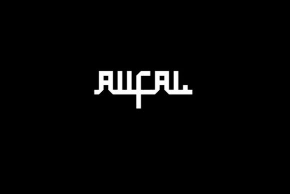
As a UI designer who builds landing pages, SaaS dashboards, and e-commerce experiences, I treat typography as functional infrastructure—not just decoration. That’s why Aufal stands out: it’s a free display font with strong visual character that works *with* digital interfaces, not against them. Its clean, cool geometry balances playfulness and polish—no awkward curves or excessive contrast to distract from content or compromise readability at scale.
Aufal isn’t built for body copy. It’s designed for impact: hero headlines, section dividers, branded banners, and high-visibility CTAs where tone and recognition matter more than paragraph length. The letterforms feature subtle angularity, open counters, and consistent stroke weight—traits that hold up crisply on retina screens, maintain legibility in tight spaces (like mobile navigation bars), and avoid the “fuzzy” rendering common with overly stylized script or handwritten fonts.
In practice, I use Aufal most often in three contexts: brand-first layouts, conversion-driven sections, and visual rhythm control. For a boutique online store launching a summer collection, I set product category headers in Aufal at 48px on desktop and 32px on mobile—paired with a neutral sans serif like Inter or Manrope for descriptions. The contrast signals hierarchy instantly: shoppers scan first, then read. On a coaching website’s hero section, Aufal anchors the headline (“Clarity Starts Here”) while the subhead and button stay in a highly legible, accessible sans serif—keeping trust and action clear.
Readability isn’t just about size—it’s about context. Aufal performs well over light and dark backgrounds, but I avoid placing it directly over busy image overlays without sufficient contrast padding or subtle text shadows. On dark mode interfaces, I test its rendering at smaller sizes (e.g., 24px section titles) and often add 1–2px of letter-spacing to prevent visual crowding. It also scales cleanly in responsive layouts: no reflow issues, no unexpected line breaks, and no need for custom @media tweaks just to keep spacing intact.
Font pairing is where Aufal shines strategically. As a display font, it pairs best with typefaces that recede gracefully—not compete. I default to humanist sans serifs (like Poppins or Lato) for UI text, forms, and navigation. For editorial-focused sites—a design blog or course platform—I’ll pair it with a warm, low-contrast serif (e.g., Cormorant Garamond) for article titles, letting Aufal handle only the most prominent brand moments: logo lockups, chapter headings, or featured instructor names. This creates tonal balance: Aufal brings energy; the supporting font brings authority and flow.
For logo design or wordmark usage, Aufal holds up surprisingly well—even at small sizes (down to 20px in favicon-style treatments or app icon labels). Its letter spacing is naturally generous, and uppercase settings feel intentional, not forced. I’ve used it successfully in digital brand kits for creative entrepreneurs: applied consistently across site headers, email footers, and social media cover graphics. Because it’s a freebie, it lowers the barrier for early-stage founders testing visual identity before investing in a premium font license.
That said—licensing matters. While Aufal is free for personal and commercial use, always verify the included license terms before embedding it into client websites, SaaS products, or downloadable templates. Some free fonts restrict use in software-as-a-service environments or prohibit bundling in editable design assets. Check whether the package includes WOFF2 files (essential for web performance), multiple weights (Aufal is typically single-weight, so plan hierarchy via size and spacing—not boldness), and basic multilingual support (Latin-1 extended coverage is standard; Cyrillic or Vietnamese may be limited).
It’s also worth noting what Aufal doesn’t do—and why that’s an advantage. It’s not a variable font. It doesn’t include stylistic alternates or swashes. There’s no italic version. That simplicity makes it predictable in CSS: no complex @font-face declarations, no fallback confusion, and no unexpected rendering shifts across browsers. For designers prioritizing speed, consistency, and maintenance efficiency, that reliability is a quiet superpower.
I reach for Aufal when I need to signal creativity without sacrificing clarity—on portfolio sites for illustrators, banner graphics for digital ad campaigns, or headline treatments for newsletter sign-up modals. In one recent project for a mindfulness app, we used Aufal only for the onboarding screen’s core value statement (“Breathe. Notice. Return.”), then switched entirely to a system font stack for all subsequent UI text. That restraint made the message land harder—and kept cognitive load low during user setup.
For online stores, it’s especially effective in limited, high-signal placements: “New Arrivals” banners, limited-edition tags, or seasonal campaign headers. Avoid using it for price displays or product SKUs—stick to monospaced or ultra-legible sans serifs there. And never force it into small buttons (<16px); instead, use it for the button’s label *only* if the container is generously sized (e.g., full-width CTA blocks on landing pages).
Ultimately, Aufal earns its place in my toolkit because it answers real questions: How do I make a brand feel distinct without undermining usability? How do I guide attention without shouting? How do I build consistency across touchpoints without over-engineering? It’s not a Swiss Army knife—but as a focused, well-crafted display font, it solves specific, frequent problems in web design with quiet confidence.
If you’re evaluating freebies for your next digital project, treat Aufal as a tone-setter—not a catch-all. Use it where personality needs to lead, where space is intentional, and where every pixel supports both aesthetics and action. Then step back, let the supporting typography do the heavy lifting, and watch how much stronger your layout feels.